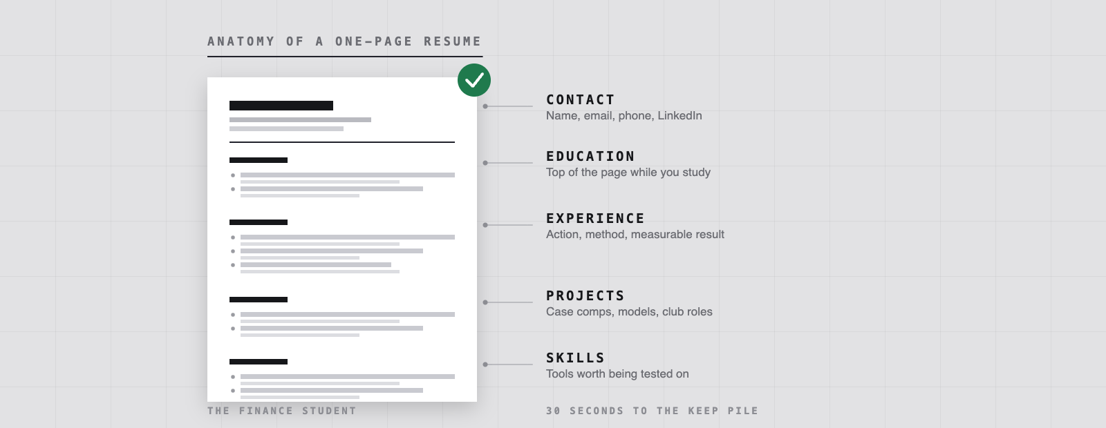
Nobody in an Ottawa hiring team is reading your resume. They are scanning it. Job Bank, the federal government job site, tells applicants to assume roughly 30 seconds of attention on a first pass, and Purdue University’s writing lab puts the ceiling at about 35 seconds before a document goes in one pile or the other. Whatever the real number is at a given branch or on a given trading floor, it is short enough that layout decides how much of your substance ever gets read.
That is the actual argument for one page. Not a rule handed down by recruiters, just an honest estimate of how much anyone absorbs in half a minute.
One page is still the default for students
Indeed’s guidance is that a single page is ideal for students, new graduates and anyone with roughly one to ten years of experience, and that length matters less than readability and content. Job Bank draws the wider line at two pages for the general workforce. For an undergrad with two summers, a club exec role and a case competition, the second page is padding, and padding is the thing a scanner notices first.
The exceptions are narrow: academic CVs, co-op applications that ask for transcripts or a portfolio, and postings that explicitly request more. If nothing in the posting asks for length, keep it to one.
Put the good material in the top-left
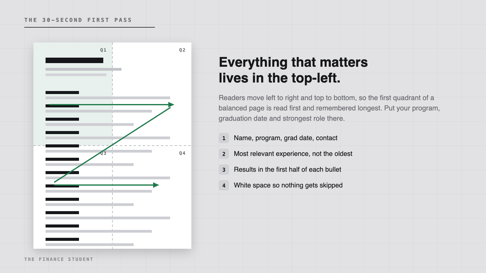
Purdue’s resume design handout suggests splitting the page into four quadrants and checking that each has a similar balance of text and white space. On a balanced page the eye starts top-left, which is where your name, program, graduation date and single strongest experience belong. The same handout warns against going past three columns, because every column break is another place the reader stops.
One related habit worth breaking: Harvard’s career services guide tells students not to start lines with dates. Lead with the employer and the role. The date is the least interesting thing on the line, and in the top-left quadrant it is expensive real estate.
The order that makes sense while you are still in school
Harvard’s advice is to list your headings in order of importance and to keep entries inside each heading in reverse chronological order. For a student in Ottawa that usually means education sits near the top: school, program, expected graduation, and your GPA only if it helps you.
Then experience, then the projects and club roles that show judgement, then a short skills line. Once you have a year or two in a full-time finance role, education drops below experience and stays there for the rest of your career.
One bullet, rebuilt
Carleton’s Career Services teaches bullets as SAR statements, which is a compact way of saying situation, action, result. Job Bank makes the same point from the other direction: do not simply list job responsibilities, because the duties are already obvious from the job title. Harvard puts “not demonstrating results” in its top five resume mistakes.
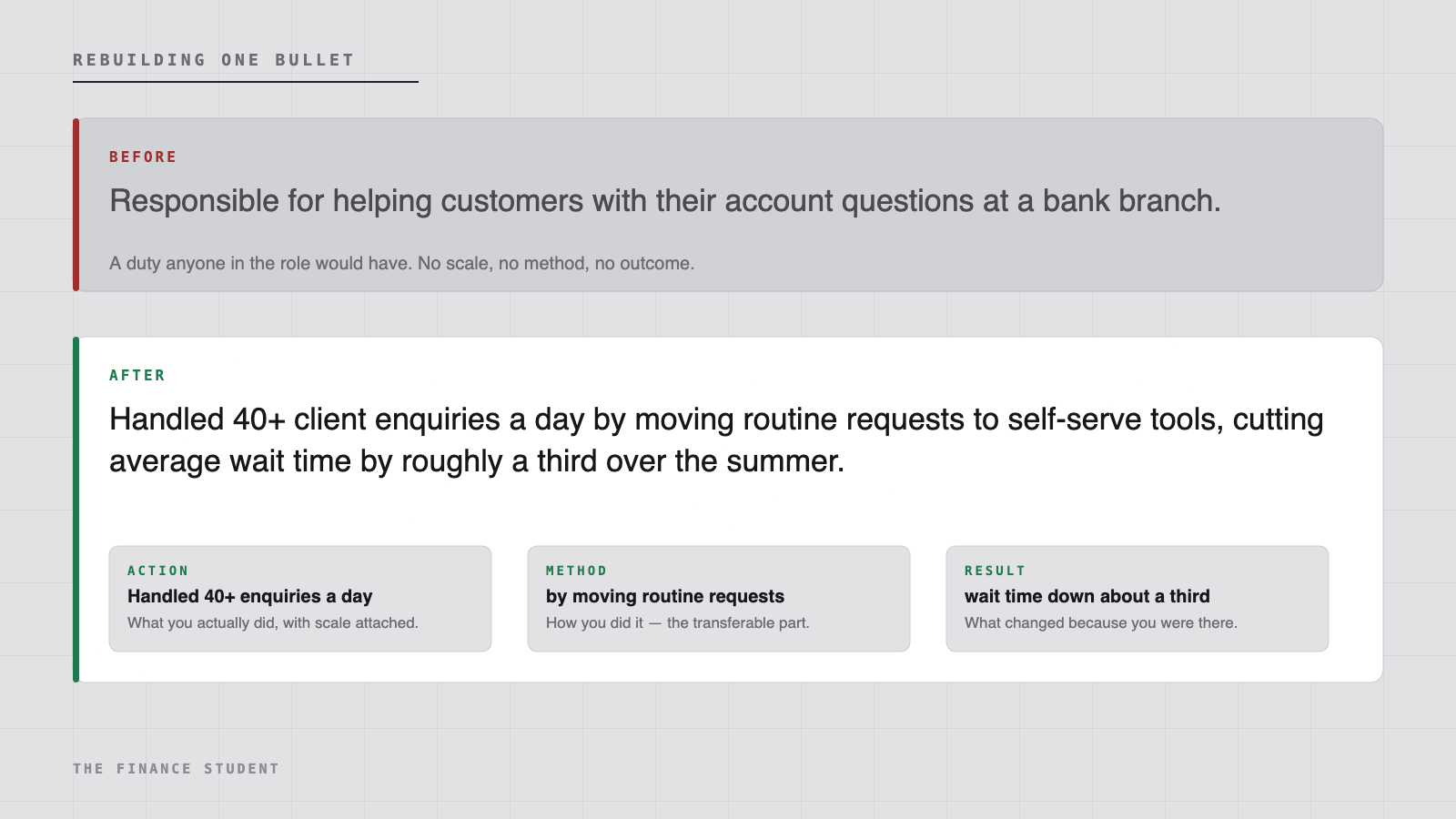
The test is simple. Could a classmate with the identical job title write your sentence word for word? If yes, you have written a duty, not an accomplishment. The numbers do not have to be impressive to do the work: 40 enquiries a day, 12 new members recruited, a three-hour weekly reconciliation cut to 40 minutes.
Job Bank also suggests capping each section at five to seven bullets. Beyond that the section stops being scannable and starts being a wall.
What to cut, and why
Most of the space students lose goes to material that was never going to earn an interview. Job Bank is blunt about the Canadian conventions here, and Harvard’s list of what to avoid overlaps almost exactly.
- The objective statement. It describes what you want; the reader is deciding what you offer.
- A photo. Job Bank notes it is not the norm in Canada and can work against you.
- Your Social Insurance Number, age, marital status or anything else that invites bias.
- References, or the line promising them on request. Keep them on a separate sheet until asked.
- Reasons for leaving previous jobs.
- High school, once you have any post-secondary experience worth listing.
- Software everyone claims: email, web browsers, basic word processing.
- Personal pronouns and abbreviations, both of which Harvard flags directly.
Everything you cut buys space for a project, a case competition or a part-time job where you actually handled something.
Make it readable by machines as well as people
Carleton’s guide explains applicant tracking software plainly: it screens resumes for keywords, experience and training, then files your contact details and documents in a database that a human works through afterwards. Indeed adds that employers are increasingly running AI tools over the same pile. Neither is a reason to stuff the page with keywords, but both are a reason to use the posting’s own vocabulary where it honestly applies to you.
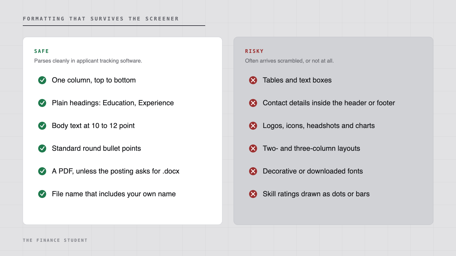
The practical version: one column, standard headings, contact details in the body rather than the header or footer, 10 to 12 point body text, and a PDF unless the posting asks for something else. Harvard adds a step people skip, which is opening the exported PDF and checking that the formatting survived the conversion.
Where to get it checked in Ottawa
Carleton Career Services runs drop-in reviews in 401 Tory, Monday to Friday from 1:00 to 4:00 p.m., with the last check-in at 3:30, and books appointments by email or phone. Bring a printed copy and the posting you are targeting, because tailoring is the part an advisor can actually help with. Job Bank has a free resume builder attached to a Job Bank account, and Harvard’s guide publishes a long action-verb list organised by skill type that is useful no matter where you study.
Then use it. The New Hirings section on our Ottawa page tracks live student and new-grad postings at RBC, BMO and Scotiabank, and each one gives you a different set of words to mirror. One page, rewritten slightly for each posting, beats a general resume sent everywhere.
A ten-minute check before you send
- The file name contains your own name, not “resume final v3”.
- It is a PDF, unless the posting asked for a .docx.
- It is one page, and the page is balanced rather than crammed.
- Contact details are correct, current and sitting in the body of the document.
- Every bullet ends in something that changed.
- No pronouns, no abbreviations, no dates leading the line.
- Tense and formatting are consistent all the way down.
- The posting’s key terms appear where they are true.
- You read it out loud once, then had someone else proofread it. Job Bank rates spelling and grammar errors as the fastest way to lose a callback.
Sources
- Harvard FAS Mignone Center for Career Success, guide to creating a strong resume, quick tips and action verbs
- Government of Canada Job Bank, how to write a good resume
- Purdue OWL, resume design, the quadrant test and page balance
- Indeed Career Guide, how long a resume should be
- Carleton University Career Services, resume, cover letter and CV guides, SAR statements and applicant tracking software
Details from the organizer’s page. Confirm the date, price and registration with the organizer before you go. Shown as $0.00 when the organizer lists no cost.
Posted July 28, 2026